148 | Cognitive Science for Data Visualization with Lace Padilla
Data Stories
00:00
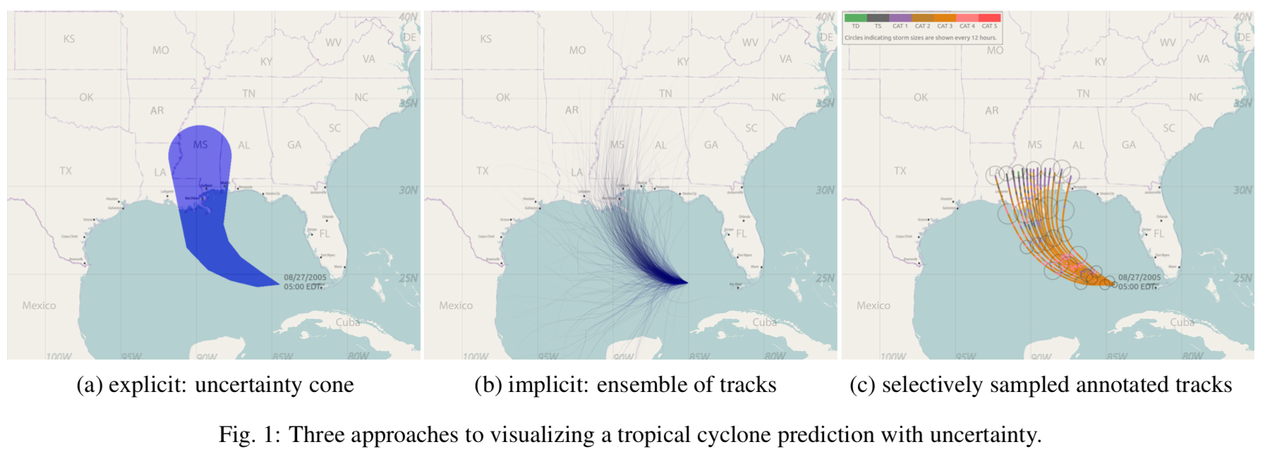
The Cone of Uncertainty: A Baseline Evaluation
We compared the cone of uncertainty to four other visualization techniques including a new one created by my collaborators which we call an ensemble display but you'll probably hear it called a spaghetti plot. We went about seeing if you know people make different damage ratings when they look at these different visualizations and part of the question is you know maybe they don't maybe the visualization doesn't matter so that would be pretty good to know what actually influences people's decisions.
Play episode from 26:22
Transcript