1: I Don't Really Like Work
Cortex
00:00
The Three Icons in the Dock of Your iPhone
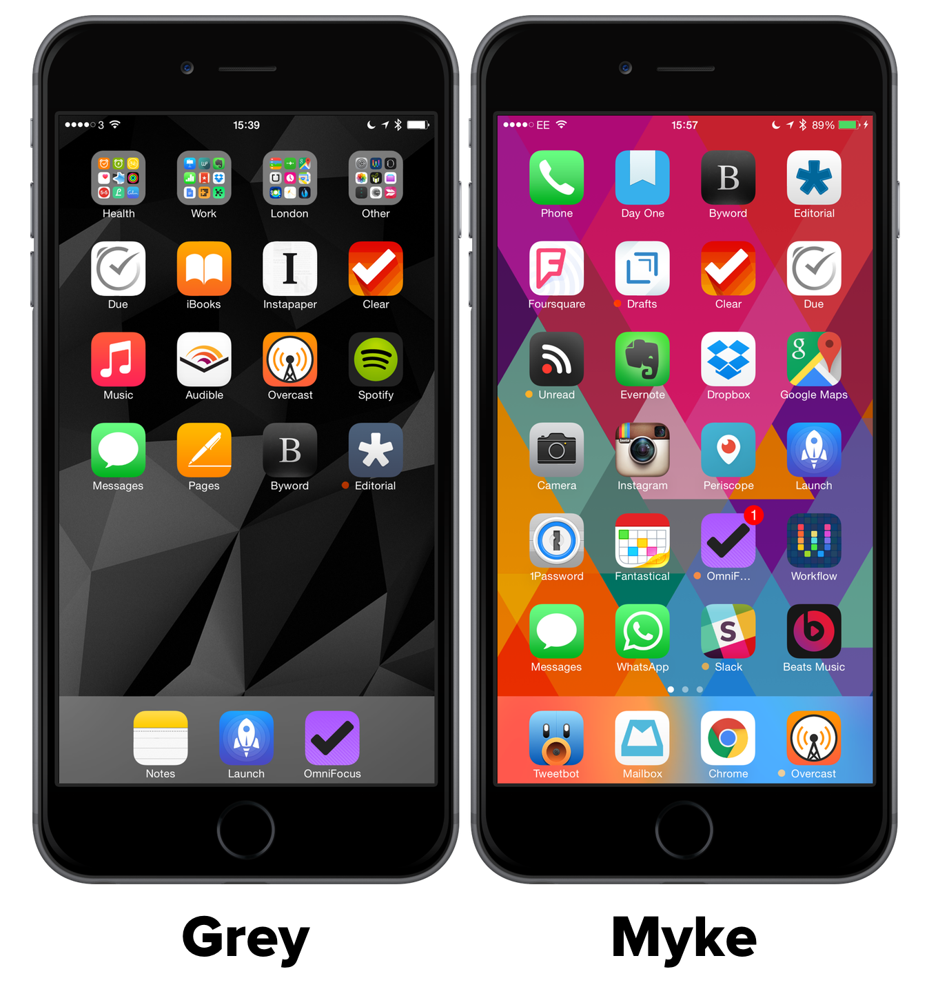
i do not like multiple screens for various reasons. But on my iphone, especially with the six plus, i was absolutely determined to fit everything on to a single screen. I just want to open up the phone and it's all right there. There is no secondary page to go to. It looks visually so much more pleasing if you have three s in your dock than if you have four icons in your dock. Mike, you have to agree, right? Doesn't it look nicer? Except for the folders. O, silly me.
Play episode from 42:24
Transcript


