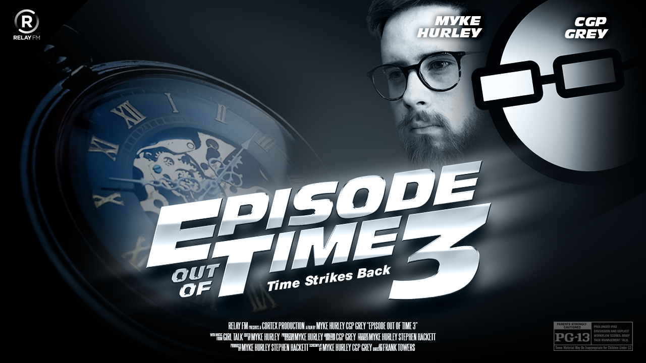
54: An Episode Out of Time 3: Time Strikes Back
Cortex
00:00
Is There a Need for More Rows on the Home Screen?
There's two empty rows. A caverns I might even call it between the applications and the dock. It looks like it's just dirty like I could really badly paint in war. And so yeah, no need to fill up those entire rows. Just looks really ugly when you do that. So agenda is how thick that icon is. Like they're really like, we want to make it maximum 3D stands above all the other icons. We're at full heart that our agenda. Yeah, sure. Your sweetheart agenda right there. Yep.
Play episode from 37:17
Transcript


